If you have made it this far…
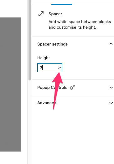
Note: After writing this blog post I then realised that there already exists the ability to change the units of the spacer block! Clicking on the px unit gives you a drop down of different options – so you can go ahead and ignore this article really…
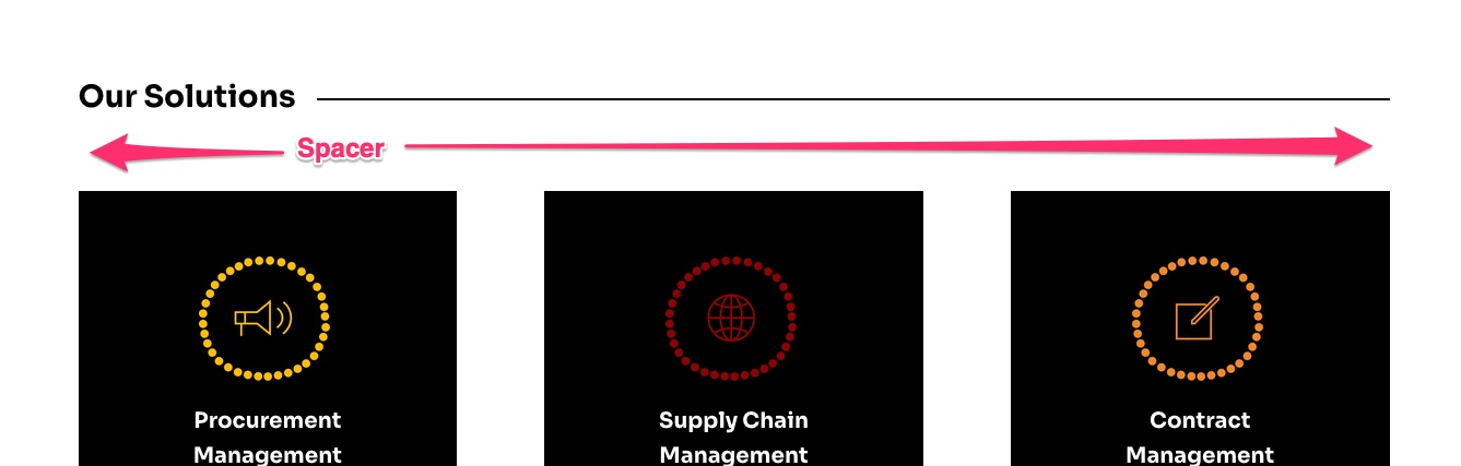
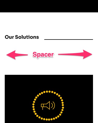
I am the first to admit it – the spacer block from the new editor (Gutenberg) is really handy! I love being able to add a little more white-space between elements on a page. If I did have one critisicm though it is that the current iteration of the spacer block is not very responsive. My default gap (100px or 50px) looks great on desktop devices, but on mobile screens that space gets awkwardly large:
A quick and easy workaround is to add a responsive clause, after a bit of tweaking I have arrived on the following:
@media all and (max-width: 1160px) {
   .wp-block-spacer {
      height: max(5vw, 20px) !important; // tweak these numbers as needed
   }
}
Just a little explainer: the max function will pick the largest of the 2 inputs (5% of the viewport width or 20 pixels). This way the minimum space will always be at least 20px.
Of course feel free to experiment with those numbers as need to suit your website’s aesthetic. Check out the screenshot below to see a before and after:

This example shows the type of nuance that may be required from a page builder like Gutenberg. The ability to use % units instead of pixels in the spacer block would be very helpful…